Posts

The Tampa Feasibility Report featuring R based Visualizations

Image
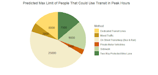
  Visualizations for Professional Writing's Final Deliverable These visualizations were taken from FDOT data for our local district on the subject of transit usage, and crash data that was munged into relative ratios that had a regression performed on these variables within.  Pie Chart The above figure is a pie chart using data collected that estimates the higher end limits of hourly numbers of passengers that could utilize each method of public transportation during peak hours Transit Regression This figure here shows the monthly totals for crashes, fatalities and serious injuries from accidents recorded within FDOT data and the regression line method was used against the 'free_y' inputs which allowed there to be a 95 percent confidence regression on the other two variables from the one in question showing certain trends within and between variables. Bus versus Pubic Transport with 95 percent regression line fitted The same style of regression was sued here but this time i

R Package: pfStat

Image
 Final Project: pfStat, a personal finance mini-suite in R GitHub URL: https://github.com/tahousex/pfStat What is pfStat? This package is entitled pfStat, and is a small package with a few functions dedicated to helping a user calculate different personal finance metrics. The functions include the ability to derive Returns on Interest, Tax Rates based on Income, Taxable Income and Home Equity, and the purpose behind choosing these kinds of metrics was to emphasize the importance of knowing where one puts their wallet. It goes without being entirely sanctimonious that the dollar does not go as far as it once did, and knowing where one stands amongst their own finances and parameters in the financial world will assist them in making more calculated decisions.  The Functions: The taxrate() income receives input from the user income and state tax percentage represented as a decimal percentage (0-1)   and gives the user output of a dollar amount of the taxes owed based on the input The taxa

Visual Analytics Final Project: Portuguese Wine and Which Components Correlate to Higher Quality

Image
  Visual Analytics Final Project Tyler House 2023-04-27 library (ggplot2) library (ggcorrplot) library (ggmap) library (ggraph) library (ggpubr) library (tidyverse) library (ggthemes) library (dplyr) library (readr) library (tinytex) library (latexpdf) library (stats) winedata <- read_csv ( "C: \\ Users \\ tyler \\ Desktop \\ Spring 2023 \\ Visual Analytics \\ Final Project \\ winequality-red.csv" ) str (winedata) ## spc_tbl_ [1,599 × 12] (S3: spec_tbl_df/tbl_df/tbl/data.frame) ##   $ fixed acidity        : num [1:1599] 7.4 7.8 7.8 11.2 7.4 7.4 7.9 7.3 7.8 7.5 ... ##   $ volatile acidity     : num [1:1599] 0.7 0.88 0.76 0.28 0.7 0.66 0.6 0.65 0.58 0.5 ... ##   $ citric acid          : num [1:1599] 0 0 0.04 0.56 0 0 0.06 0 0.02 0.36 ... ##   $ residual sugar       : num [1:1599] 1.9 2.6 2.3 1.9 1.9 1.8 1.6 1.2 2 6.1 ... ##   $ chlorides            : num [1:1599] 0.076 0.098 0.092 0.075 0.076 0.075 0.069 0.065 0.073 0.071 ... ##   $ free sulfur

Module 13: animation package and GIF in RStudio

Image
  module13.R Tyler House 2023-04-06 #Module 13 R Programming #install.packages("animation") ##Example Animation provided by Dr Friedman library (animation) ## Warning: package 'animation' was built under R version 4.2.3 friedman <- saveGIF ({   for (i in 1 : 10 ) plot ( runif ( 10 ), ylim = 0 : 1 ) }) ## Output at: animation.gif #My Animation tyler <- saveGIF ({     for (i in 1 : 50 ) plot ( runif ( 50 ), ylim = 0 : 1 )   }) ## Output at: animation.gif ##I generated my own visual based off the framework provided initially. I found this to be a very interesting concept within R #Aditionally, I have some questions regarding more of the practical usages of a randomized GIF animation other than for decoration. #Are there kinds of analyses that would use visuals such as this? And if so, why are they more effective than other visuals in that specific case. This was the example given by Dr. Friedman, which is moderately populated

Module 12: Net Madness

Image
 Module 12: Net Madness ##Module 12: Node visualization madness #install.packages("GGally") #install.packages("network") #install.packages("sna") library(GGally) library(network) library(sna) library(ggplot2) net = rgraph(10, mode = "graph", tprob = 0.5)  net = network(net, directed = FALSE) network.vertex.names(net) = letters[1:10] ggnet2(net) ggnet2(net, node.size = 6, node.color = "black", edge.size = 1, edge.color = "grey") ##This visualization was a success and I want to know the pratical application of these nets. ##In the sources provided from the github link, what I saw was a lot of R specific jargon that I do understand ##The issue is not understanding it or what is happening, but the why? Why would data professionals use this kind of visualization in the real world applications?  

Module 11: Tufte Visuals

 Module 11: Tufte Visuals ##Module 11: Tufts Visualizations ##install.packages(c("CarletonStats", "devtools", "epanetReader", "fmsb", "ggplot2", "ggthemes","latticeExtra", "MASS", "PerformanceAnalytics", "psych", "plyr")) ##nstall.packages(c("prettyR", "plotrix","proto", "RCurl", "reshape", "reshape2"))                   library(CarletonStats) library(devtools) library(epanetReader) library(fmsb) library(ggplot2) library(ggthemes) library(latticeExtra) library(MASS) library(PerformanceAnalytics) library(psych) library(plyr) library(prettyR) library(plotrix) library(proto) library(RCurl) library(reshape) library(reshape2) #Example R Script 1 library(devtools) source_url("https://raw.githubusercontent.com/sjmurdoch/fancyaxis/master/fancyaxis.R") x <- faithful$waiting y <- faithful$eruptions plot(x, y, mai

Module 11: R Debugging and Defensive Programming

 Module 11: R Debugging and Defensive Programming ##Module 11 Debugging #Libraries library(dplyr) library(plyr) library(tidyverse) #Raw code with first edit tukey_multiple <- function(x) {   outliers <- array(TRUE,dim=dim(x))   for (j in 1:ncol(x))   {     outliers[,j] <- outliers[,j] ##&& tukey.outlier(x[,j])   }   outlier.vec <- vector(length=nrow(x))   for (i in 1:nrow(x))   { outlier.vec[i] <- all(outliers[i,]) }    return(outlier.vec) } ##Second edit  tukey_multiple1 <- function(x) {   outliers <- array(TRUE,dim=dim(x))   for (j in 1:ncol(x))   {     outliers[,j] <- outliers[,j] ##&& tukey.outlier(x[,j])   }   outlier.vec <- vector(length=nrow(x))   for (i in 1:nrow(x))   { outlier.vec[i] <- all(outliers[i,]) }    return(outlier.vec) } #test block load(airquality) ac <- airquality str(ac) head(ac) tukey_multiple(ac) tukey_multiple1(ac) #The result of my debugging is that the first error discovered was the return statment return(outl